General
A building is required to be made accessible by getting the attention of the users by symbols of the facilities available, in order for people to be aware of the existence of the facilities. All signage shall be permanent and displayed to direct or indicate the location of the facilities in the building.
People with disabilities may have limitations in the movement of their head or a reduction in peripheral vision. Signs positioned against the path of travel are easiest for them to notice. Persons can generally distinguish signs within an angle of 30° to either side of the centre line of their faces without moving their heads.
The form of the symbol of access shall comply with the following:
· Shall consists of two elements, namely, a symbolised figure in a
wheelchair and a plain square background;
· The proportional layout of the symbolised figure shall be as shown;
· The colour of the symbolised figure shall be white on a blue
background; and
· The symbolized figure shall face to the right.
The symbol of access shall be displayed, outside the building to identify buildings with accessible facilities and at areas where facilities are provided for persons with disabilities.
The Symbol shall be used to identify accessible features and facilities used by persons with disabilities. Other examples of symbols are shown below:


DIRECTIONAL SIGNS
Directional signs shall be displayed at lobbies, corridors or at points where there is a change in direction, to direct people with disabilities to the various facilities such as lifts, entrances, toilets, vehicle parks, etc. If the location of the designated facility is not obvious or is distant from the approach viewpoints, directional signs incorporating the symbol of access should be placed along the route leading to the facility.
The contents of signs shall be simple, short and easy to understand. The text and use of pictographs shall be consistent throughout the building, as shown below.

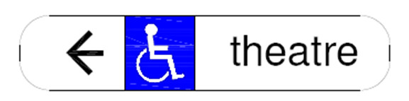
Directional Sign
SERVICE IDENTIFICATION SIGNS
Service identification signs incorporating the symbol of access, shall be displayed at various facilities and destinations for persons with disabilities such as lifts, entrances, telephone booths, toilets, vehicle parks, staircases and the like.
Tactile signs incorporating pictographs shall indicate whether the toilet is for male or female.

SIGNAGE
Character and symbol specifications
Letters and numbers on signs shall –
(a) use sans serif font; and
(b) have Arabic numbers.
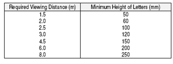
The size of the symbols shall be based on the intended viewing distance and determine as shown below:

Text and Pictographs
All text shall be –
· In title case; and
· Arrange with left alignment
Arrows shall be located on the side of the sign to which they are pointing, that is, arrows pointing left shall be on the left and arrows pointing right shall be on the right. Braille shall be located directly below the text or arrow and arranged with left alignment.
Location and height of signs
The height of the different letters of the different location shall be of:
Internal signs shall be mounted on the wall next to the latch-side of the door and not on the door itself. The centre line of the sign shall be of a height of 1500mm (give or take) above the floor level, where there is no wall space to the latch-side of the door including double-leaf doors, signs shall be placed on the nearest adjacent wall.
Suspended signs should be avoided as it is not within the field of vision for some persons with visual impairment.
Characters or Symbols
Characters, symbols or pictographs on tactile signs shall –
1. be raised at least 1mm;
2. be between 16-15mm high; and
3. be mounted at a height from the center line of the sign of 1500mm above the floor level. If there is no wall space to the latch-side of the door, signs shall be placed on the nearest adjacent wall.
Characters and graphics shall be glare free, and have colour and tone that contrast with the following background:
· within the sign;
· with the surrounding or substrate. The following are examples of colour contrast;-

Colour Contrast
However, do note that the graphics refers to the entire signage board, such as the text/characters and symbols. To ensure that the colour does not changed when located on both light and dark backgrounds, a contrasting border shall be placed around the sign. All signs shall not have any sharp edges, and should be fitted into a frame. Illuminated clear glass or acrylic signs with coloured etched legend are not acceptable for legibility reasons. Signs which need to differentiate between sexes, such as toilet, should have clear and simple symbols with colour distinction between male and female, example blue colour for male and pink colour for female.
Braille and pictographs
Braille shall be, whenever possible, used when characters are used. It shall be dome shaped and be easily touch and read. The sign shall be mounted at an acceptable height. Pictographs shall be accompanied by a description placed directly below it. The border dimension of the pictograph shall have a minimum height of 152mm.